Businesses gain access to a large variety of data which is collected from a wide range of sources. However, the data won’t be of any use if it is not collected as per a set strategy. Also, the analysis of data plays a major role in deriving the benefits from it. Basically, the businesses should be able to leverage the data. As, the insights offer the right directions to the companies, and they are able to conceptualize an advanced courses of action. Big data analytics solutions is turning out to be quite beneficial for a wide range of firms, including the startups. The businesses are able to strategize their future based on the analytics, they are able to fine-tune sales and enhance the quality of marketing operations. But, all this is only possible when the data is collected, managed, analyzed and then visualized properly. In this article, we will focus on the visualization of big data.
Why is data visualization important?
As per one of the surveys, 53% workers believe that the presentation of the companies’ data takes a lot of manual effort. Therefore, there is no doubt about the fact that the businesses need highly advanced big data analytics and visualization techniques and tools. In order to make the data absolutely valuable for the companies, the businesses will have to visualize the data and the insights in the most appealing manner. After all, the right way the data is presented has a major role to play in identifying whether the data is actually useful or now.
Let’s understand this with an example, say you have collected a lot of data related to the customers and your target audience. The data is gathered from various sources like the website, mobile application, social media platforms, email marketing campaigns etc. But, at the end of the day, what matters the most is that how the data is analyzed and presented. Both, need a strategy. You should be able to present the data in a way that it is able to deliver the message. In this case, you should be able to decide the appropriate parameters like the click through ration, customer retention ratio, streaming data etc. Using the key parameters, the insights should be presented. That’s not it, also, the right kind of diagrams, graphs etc. have to be used in order to present the data.
Data visualization to exhibit your businesses’ or project’s performance
If your business has been performing well in the past couple of years, as compared to the last year or the last quarter, then in that case, you would want to showcase the growth in a presentable format. You would need to first collect the data related to the change in the performance, for example, if you have been delivering more, your quality has improved etc. Also, derive inputs related to the performance of each and every member working on the project. Now, with the help of comparison bars, the Perato charts etc. you can actually visualize the data. Just writing down the numbers won’t be the best way to present the data. Rather, you would like to make bar graphs etc. in order to represent the data. The message has to be delivered in an engaging manner, thus intuitive measures have to be used.
Use of the latest big data visualization tools
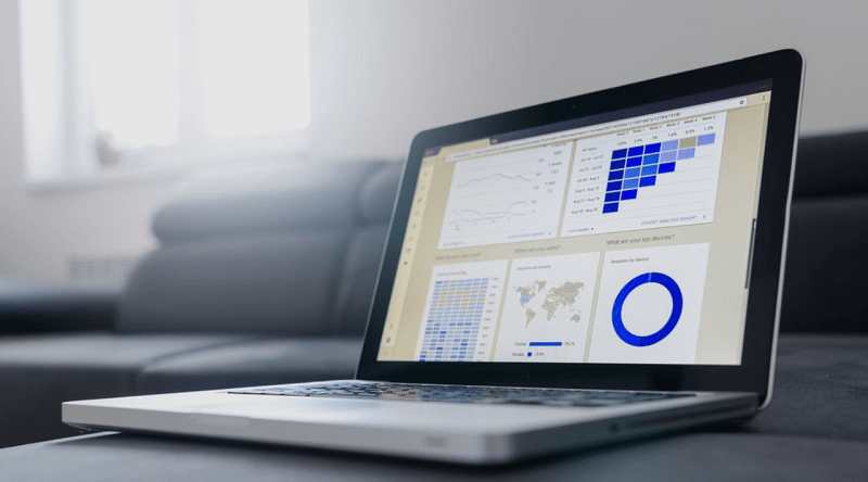
Pentaho BI, Microsoft Power BI and Tableau are a few of the latest business intelligence or big data analytics tools. All of these tools have amazing features and functions for data visualization. For example Power BI seems to have the most engaging and interactive dashboard. The dashboard is not just attractive, but it contains all the right features as well. It has very clearly described sections. Also, different sections of the dashboard are divided with the pops of color. There isn’t a lot of whitespace, as too much use of white is a little dull. However, the dashboard is not very colorful either. It is kind of striking a good balance.
In fact the ability to integrate different types of visual reports is also quite important. And, Tableau has the right set of features to embed different reports into one application or one place. Therefore, if you want to work efficiently, then the companies would have to collaborate better. And, Tableau BI Services helps the businesses to create graphs and charts and integrate them into one app. But, at the same time, the quality and vibrancy of the reports is quite impressive. The data is not only interactive but quite concise and clear as well.
New tools let you design the insights as per your will
Sometimes, the data scientists may want to try something new and present the data in a very unique or interesting manner. Many new-age data tools allow the data scientists to try out their creativity and present the data just as they want to. Tools like Power BI and Pentaho BI have numerous data visualization features and if all the features are used appropriately then the scientists will be able to showcase the data just as they would want it to be seen. Sometimes, the visualization may be better than how the humans must have perceived the data or the insights to be. This is exactly how the visualization tools are empowering the data scientists to exhibit the insights in whichever way they want to.
Data cleaning is one of the things that the data scientists have to keep in mind in order to make sure that only the refined data is used for analysis and visualization. Also, not each and every type of information can be used for data visualization. This the companies have to be selective of what they are using for analysis and visualization. After all, whatever is being generated from the data analysis cannot be shown to the whole world. Therefore, the selection of the right category of data is also important for proper visualization. Additionally, with so many high-end tools and data visualization techniques, there is no doubt about the fact that the companies can easily visualize and present the data in an impressive and engaging manner.
We hope the information in this article will help you. Stay tuned to our Programming section to get regular updates.